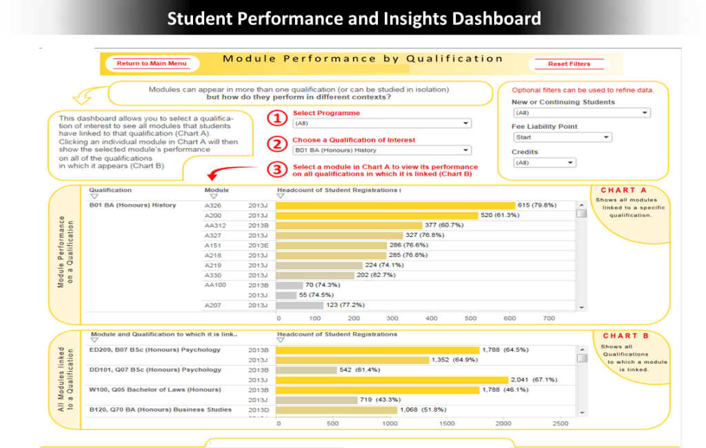


Slide 1: University Modules/Qualifications Student Performance and Insights Dashboard
Situation: There was a need for clear, data-driven insights into student performance and demographics to support decision-making across academic delivery, strategic planning, and marketing.
Actions: I designed and developed Tableau dashboards connected to a SAS Software Server. These dashboards provided insights on student performance and demographics tailored for faculty, management, course tutors, and marketing.
Results: The dashboards were used by thousands of staff and directly informed course improvements. They enabled evidence-based decisions to increase capacity in high-demand modules and qualifications, while also supporting the discontinuation of underperforming offerings..
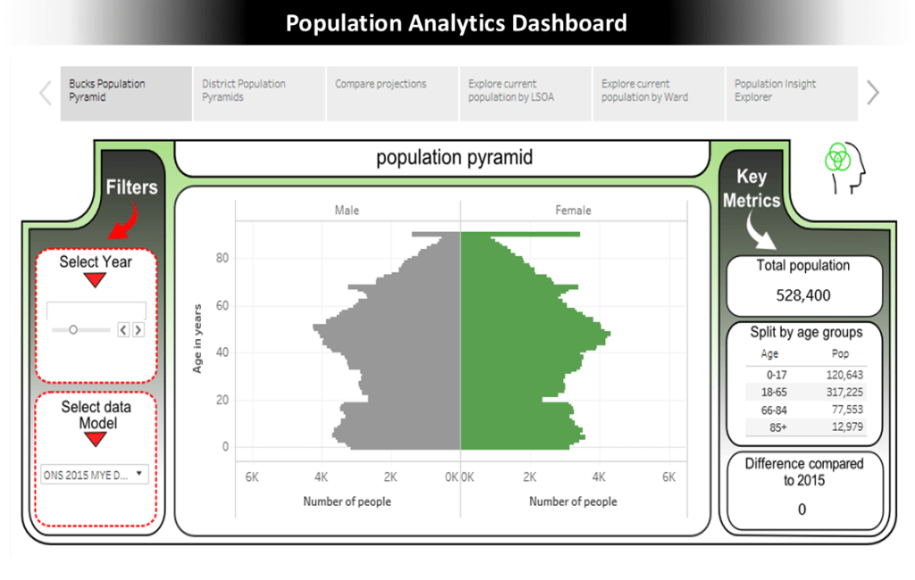
Slides 2-4: Population Analytics Dashboard
Situation: A local authority needed detailed, forward-looking insight into small-area population change to support service planning, as an aggressive housing development strategy was having profound effects on communities across the county. The objective was to gain deep insights into the county’s changing population across larger urban areas, smaller settlements, villages, and rural areas.
Actions: I developed a dashboard visualising small area population data, creating a 15-year forecast for each Lower Layer Super Output Area (LSOA) using ONS datasets and housing trajectory data.
Results: The dashboards became vital for planning strategies, for improving understanding of demographic changes, and for informing service delivery decisions influenced by population dynamics and housing developments.
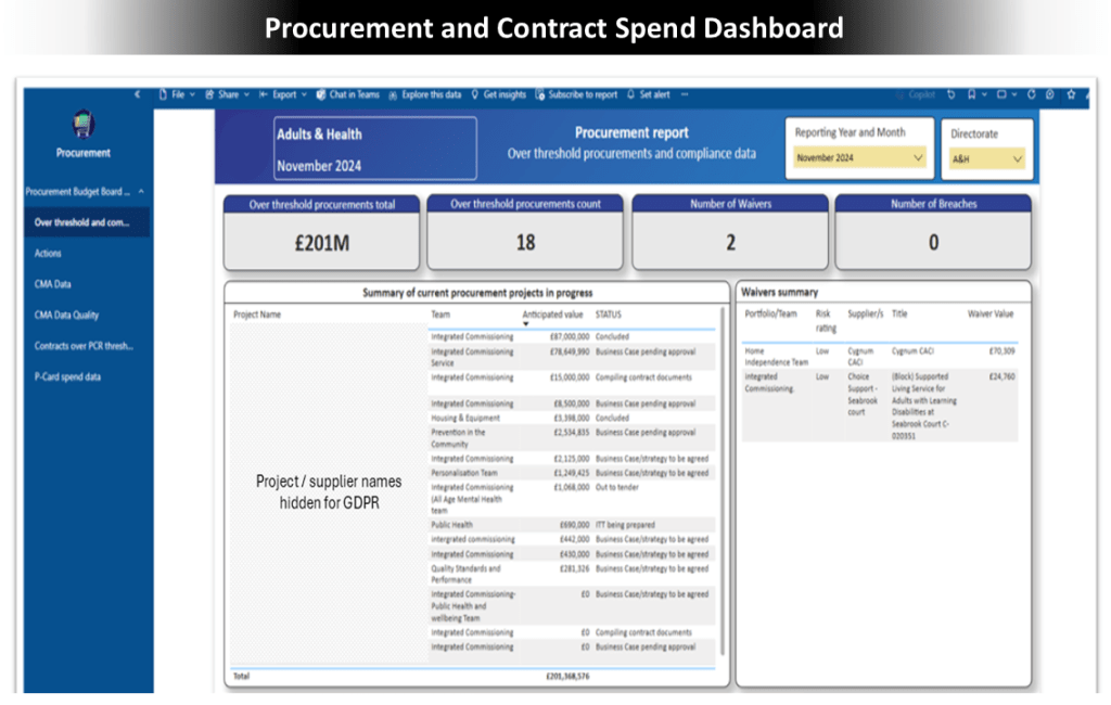
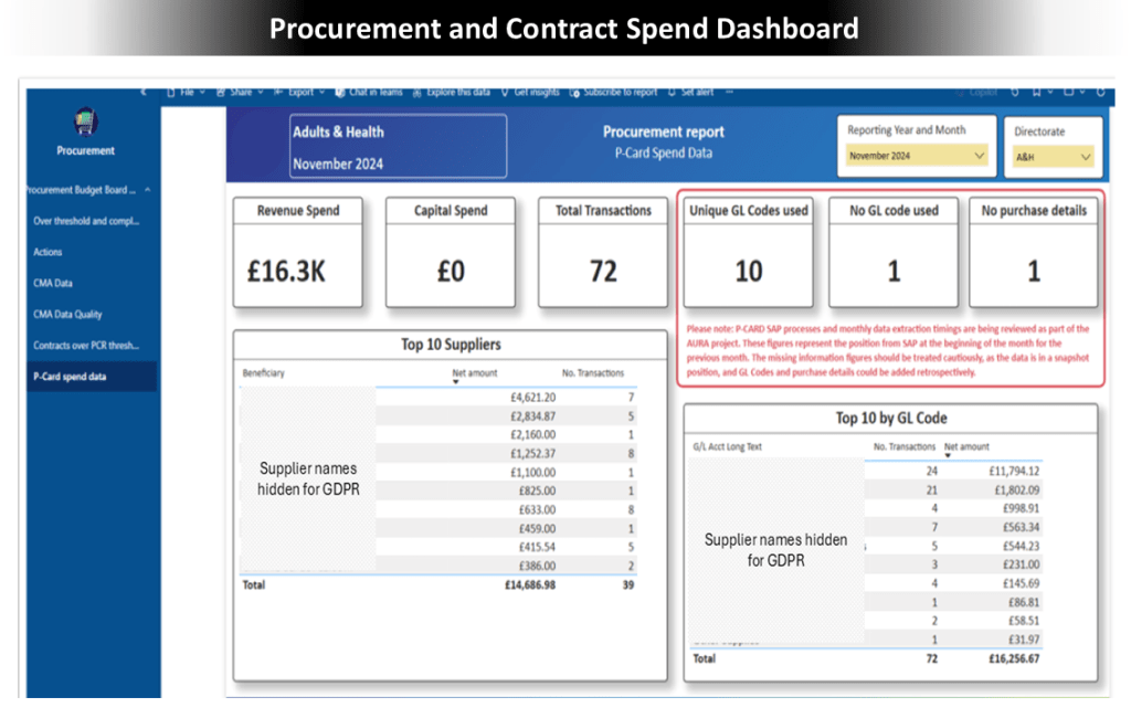
Slides 5-7: Procurement and Contract Spend Dashboard
Situation: The procurement department at a large organisation relied on manual processes for monthly reporting, leading to inefficiencies and errors.
Actions: I created a dashboard that streamlined data from core systems and automated reporting, replacing manual procedures. I also provided training for independent maintenance.
Results: The automated dashboard significantly reduced reporting time, improved data accuracy, and removed reliance on individual staff members. It increased the resilience and efficiency of the department’s reporting process, enabling timely and reliable insights for directorate and corporate management teams.
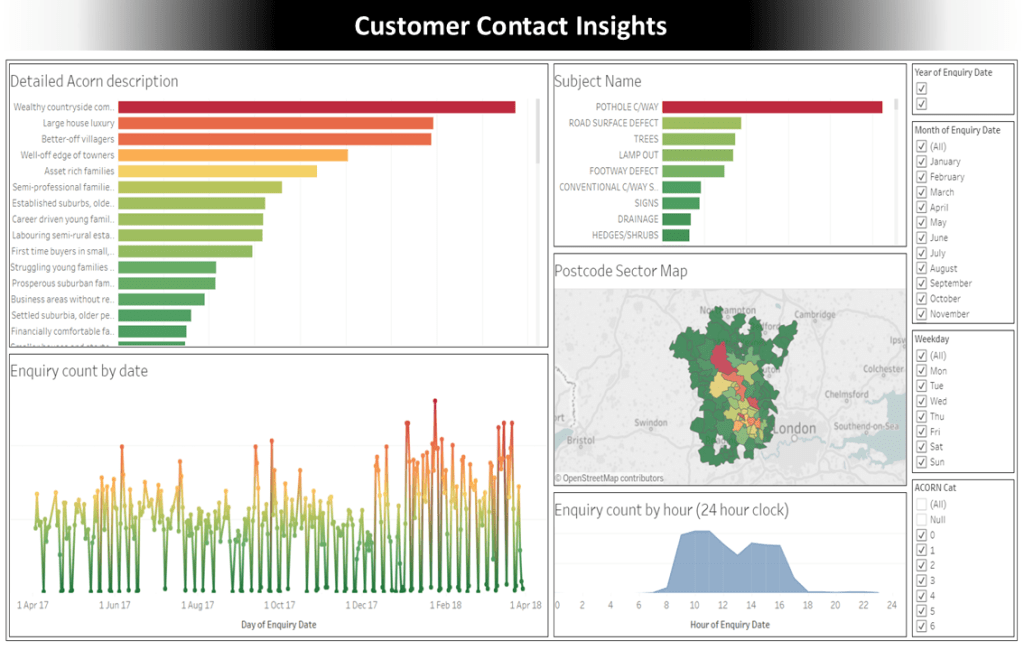
Slides 8-9: Customer Contact Insights
Situation: Call centre managers lacked a unified view of customer contact data, hindering their understanding of inquiries.
Actions: I developed an interactive dashboard to analyse contact data, revealing contactors’ locations, enquiry types, and volume trends by demographics.
Results: The dashboard provided insights into enquiry patterns, informing a strategy to enhance online support and streamline automated routing.
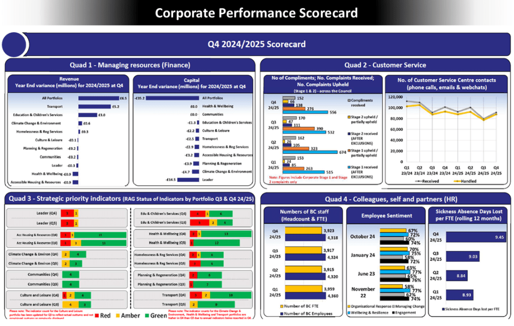
Slide 10: Corporate Performance Scorecard
Situation: A local authority needed a consistent reporting framework to present quarterly performance and ensure organisational transparency.
Actions: I created the Corporate Performance Scorecard by gathering stakeholder requirements to identify crucial performance metrics, presenting KPIs with Red/Amber/Green ratings and key indicators.
Results: The scorecard provided a clear quarterly view of performance, enhancing transparency and effectiveness in monitoring, supporting informed decision-making for leadership.
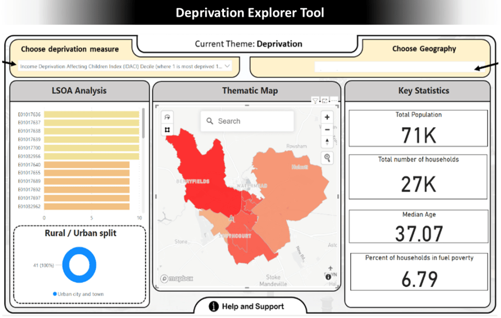
Slide 11: Deprivation Explorer Tool
Situation: Decision-makers in the Thames Valley area needed an accessible method to analyse patterns across diverse zones to better target support and interventions.
Actions: I developed the Deprivation Explorer Tool using the Index of Multiple Deprivation data, combined with key indicators and open datasets. It was visualised and made interactive in Power BI, allowing users to explore deprivation and various metrics at a detailed location level.
Results: The tool influenced strategic decision-making, enabled targeted interventions, and helped develop services for residents facing fuel poverty, ensuring that resources were allocated where they were most needed.
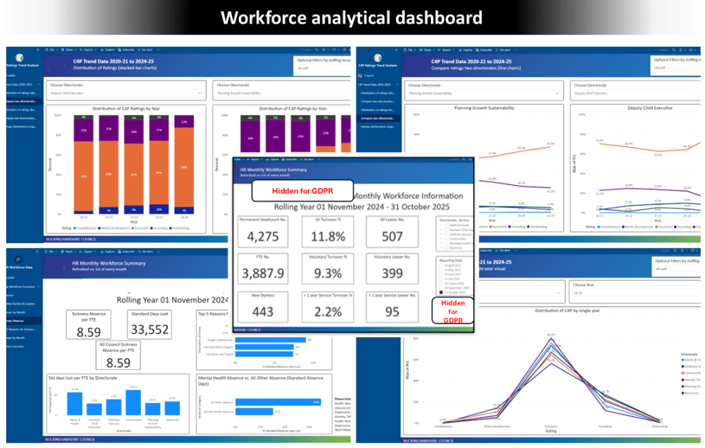
Slide 12: Workforce analytical dashboard
Situation: A program was initiated to create interactive dashboards integrated with a SAP ERP environment, requiring governance, clear data definitions, and stakeholder confidence.
Actions: I led the dashboard development program, planning and configuring within the SAP ERP, defining standards, and managing stakeholders. I produced documentation, videos, and training sessions, ensuring full automation with clear calculation logic.
Results: The program delivered reliable, scalable dashboards that gained stakeholder trust and adoption, reduced manual effort through automation, and empowered users to leverage insights for informed decision-making.
