
Slide 1: Value for Money Exceptions Report
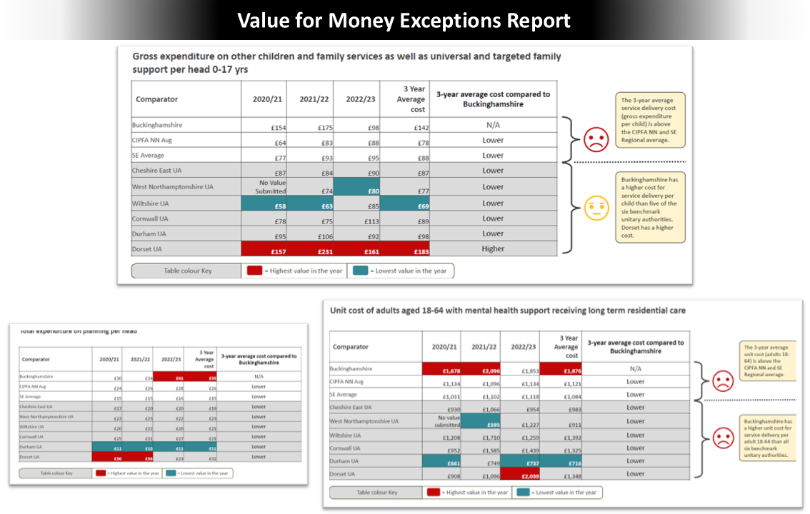
Situation: A local authority needed to understand whether it was delivering services cost-effectively compared with similar authorities, amid increasing financial pressure and scrutiny of public spending.
Actions: I conducted extensive economic research using datasets from the Ministry of Housing, Communities, and Local Government (MHCLG) on local authority revenue expenditure and financing. I developed an exception report that compared service-level costs with peer authorities (CIPFA Nearest Neighbours) and regional and national averages to identify functions with disproportionately high expenditure.
Results: The report highlighted specific high-cost service areas, triggering further forensic financial analysis and challenging existing spending provisions, supporting stronger value-for-money governance.
Slide 2: Hypothesis testing / Pareto Analysis
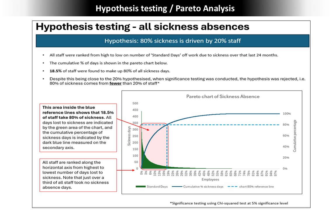
Situation: A large organisation was experiencing high levels of staff sickness, resulting in lost productivity and increasing financial pressure for HR and corporate management.
Actions: I applied hypothesis testing and Pareto (80/20) analysis* to sickness absence data to identify underlying patterns. The analysis revealed that a small proportion of staff accounted for the majority of repeated absences and pinpointed the occupation types and functions most affected.
Results: The findings enabled management to focus interventions on the most impactful areas, highlighting the importance of targeted action to address root causes of absenteeism rather than broad, unfocused initiatives.
*Pareto analysis is a technique employed to identify the most significant factors within a dataset or process, based on the observation that a small number of causes typically lead to a large percentage of the effects.
Slide 3: HE Student Cohorts Analysis / Visualisation
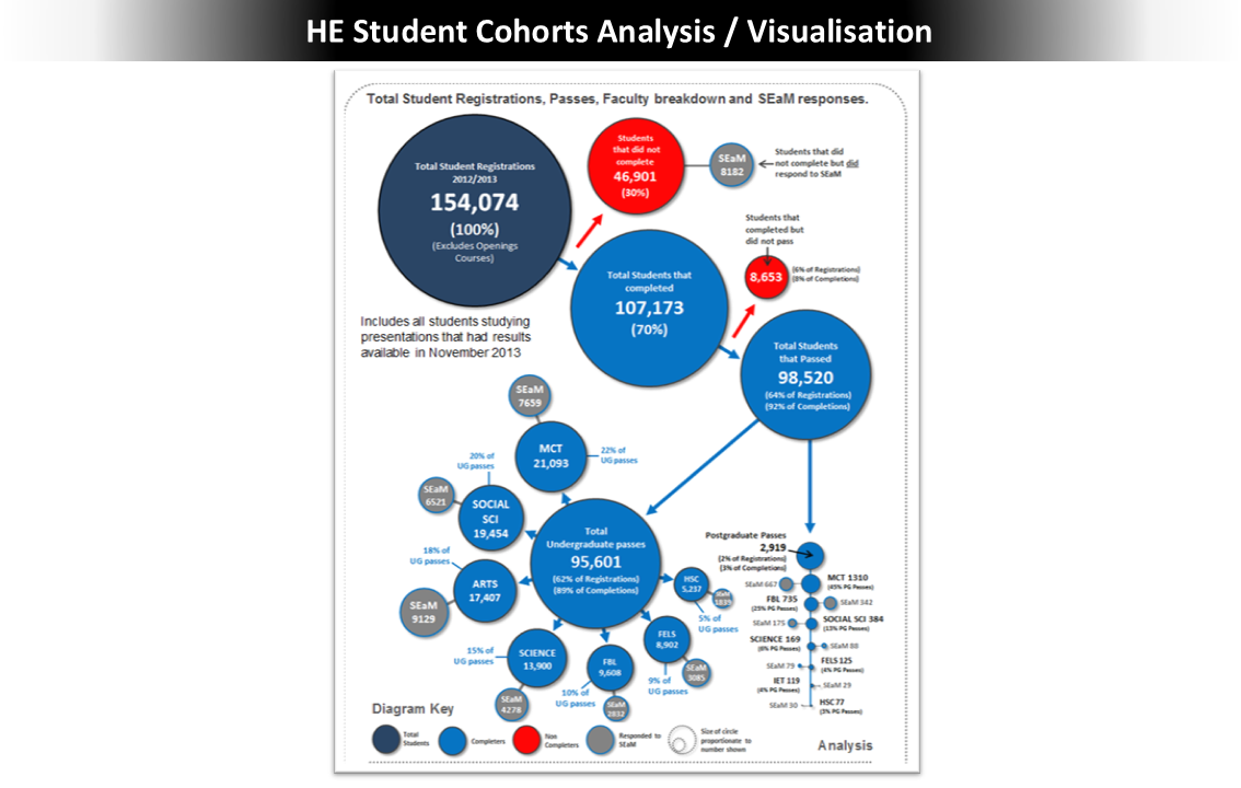
Situation: A university had access to rich internal data but struggled to convert it into actionable insight, particularly around student retention and financial risk.
Actions: I analysed student outcomes across undergraduate and postgraduate cohorts and developed a series of visualisations. One key visualisation clearly demonstrated the financial and educational impact of students who enrolled but did not complete their courses, including course- and pathway-level attrition patterns.
Results: The work prompted a change in how the university handled early student registrations. It improved understanding of the financial implications of attrition and supported more proactive intervention strategies to reduce non-completion.
Slide 4: Family Cost Tracker
Situation: A local authority needed better visibility and control over the rapidly changing costs of supporting vulnerable families, to maintain budgetary control and manage financial risk.
Actions: I developed a dashboard connected to a dynamically updated daily dataset, enabling users to track cumulative costs, analyse individual cases, and estimate future costs for families entering the support programme.
Results: The dashboard became a valuable operational tool, helping teams stay within budget, forecast future pressures, and receive early warnings when costs increased unexpectedly.
Slide 5: Prediction Tool for Future Financial Costs of Adult Social Care provisions
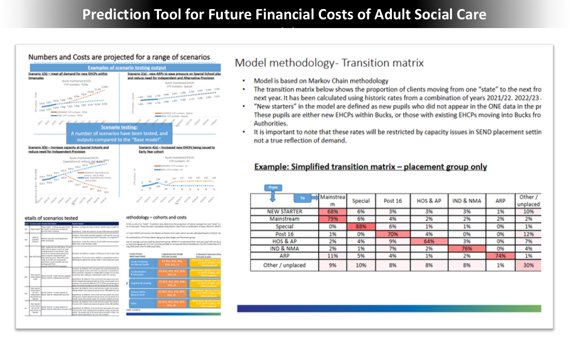
Situation: Adult social care finance managers required improved forecasting to anticipate future care costs and reduce the impact of sudden, unplanned increases in expenditure.
Actions: I project-managed and co-developed a predictive tool using a Markov Chain transition matrix to model the likelihood of clients moving between different care states over time. The tool allowed users to input cost assumptions, inflation rates, and client volumes, generating 2-, 5-, and 10-year cost forecasts.
Results: The tool provided forward-looking financial intelligence that improved long-term planning, mitigated the risk of cost shocks, and enabled more informed decision-making around adult social care provision.
Slide 6: Unit Costs Dashboard
Situation: Finance managers needed a clearer understanding of how the authority’s service delivery costs compared with those of peer organisations.
Actions: I developed a dashboard that allowed users to interrogate unit costs across services and benchmark them against other authorities. The tool enabled flexible calculations, including cost per head of population, per dwelling, or per kilometre of highway, depending on the service.
Results: The dashboard was well received and helped identify areas where contractor, provider, or staffing costs were higher than peers, supporting more effective cost control and procurement decisions.
Slide 7: Service Restructuring Savings Tracker
Situation: A corporate transformation team needed transparent, reliable reporting on savings and costs associated with a two-year organisational restructuring programme.
Actions: I designed and built a dashboard that tracked planned, forecast, and actual savings by department and at a corporate level. The dashboard incorporated redundancy costs, consultation expenses, projected future savings, and net financial impacts over a five-year period.
Results: The tool provided senior leaders with clear, monthly insight into the financial impact of the restructuring programme, supporting informed oversight, accountability, and decision-making.
